Birthday Boy
Kraft + Challenge Oct
I can see clearly now
Here is my take on the Challenge
Birthday Boy
To create this background, I have used a Dusty Attic Diamond Stencil, which I turned on its side to resemble triangles and a Tim Holtz number stencil.
The chipboard is from Dusty Attic and the Birthday Boy and Cupcake Sticker is from Porta Craft.
Paper and Button Flair used is from the Totally Rad Collection from Cocoa Vanilla.
Washi Tape is from my stash.
This balloon sticker is also from the Porta Craft Sticker packet.
I have used Glossy Accents over the balloons, cupcake, chipboard, birthday boy and clear dots on the background to create my "CLEAR" element on the page.
Clear acetate film strip also to create "CLEAR" embellishment used to create a frame on the picture.
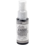
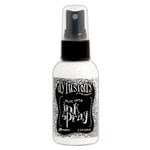
I have used Gesso, Dylusions Spray and KaiserMist to create the splatter effect on the background.
I have used the following products to create this layout.
You can click on the links to find these products.
Thanks for stopping by and I hope you have found some inspiration to create
Too see more of my designs please visit my website
You can also find me here
Thanks for stopping by
Til next time
Dream*Create*Inspire
JD
xx
*Please note this post contains affiliate links. I make a few bucks if you purchase.
Thanks for your support.


A wonderful boy's page with the use of MM to create a grungy look to match the face! Such a fun look. Thanks for playing along at Kraft+
ReplyDeleteAn awesome grungy take on the challenge. Thanks for playing along at Kraft+
ReplyDeleteI love this layout! That photo is brilliant, as is the background, those colours...everything really :) Thanks for joining us over @ K+ this month.
ReplyDeleteThis photo looks wonderful.. and love all the clear elements you have used on your layout.. thanks for joining in with Kraft+ this month!
ReplyDeleteThanks for your kind words. I loved this challenge.
ReplyDelete